myVicRoads Account Dashboard Enhancement
| VicRoads
Role
UX/UI designer
Team
UX lead
Product owner
Business analyst
Tools
Adobe XD, InVision, Pens & paper
Client
VicRoads
Backgrounds
A myVicRoads personal account has been created by over one million people since it was launched in 2016, however only 250,000 myVicRoads accounts were opened prior to the November 2017 short-term registration (STR) announcement. Research showed that the target take up rate of 50% was achievable in 12-24 months from 2019. Beyond STR and e-billing, most customers are not identifying a benefit with the account, so myVicRoads UX and Capability Program is aimed to optimise the myVicRoads accounts user experience and provide more benefits for customers with 12 services, and the myVicRoads account dashboard is one of them.
Discover
Prior Research Findings
In 2018 May, VicRoads had engaged with U1 (a UX research consultancy) to explore the user experience of the myVicRoads account. The report collected the findings and feedback from 10 user testing sessions.
Here are some key findings from the research:
New users The new users were not aware of the benefits of signing up for a myVicRoads account.
The existing users The existing users have mentioned that they were not aware of some of the services available to them or even how they received their registration reminders (many assumed they’d still get them via post by default).
The log-in button Most users easily found out the login button, however, some users found out it's not obvious to find out the login button.
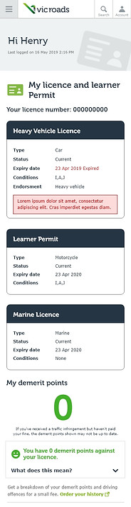
myVicRoads account dashboard Many users prefer to see their licence details on the dashboard and through it provides a good reminder for when it expired. Not every user was interested in the Direct Debit section.
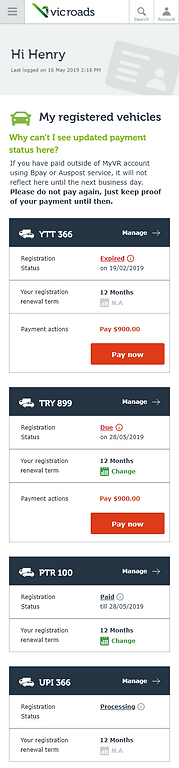
Registered Vehicles information and table Most participants expected to see a red ‘Pay now’ link under ‘Payment status’ when their payment was due.
Non-portal menu With no visual distinction between the portal (myVicRoads account) and non-portal menu items in the main menu users easily got lost or distracted when they clicked into non-portal sections.
Content Review
I also used the ROT (Redundant, Outdated, Trivial) set of heuristics to analyse content on the dashboard.
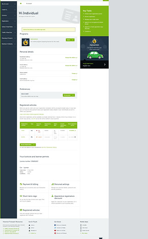
Welcome message Bounded horizons
The welcome message section is a wide and much-unused empathy space. It can be redesigned to fit in more key information relevant to users (such as notifications, licence numbers, etc.)
Notification information scent accessibility
Using concise language with the message and a CTA access to the relevant task.
Personal details collocation
Stacking the titles by two columns and two rows.
Preference appropriate structure
This is actually a registration direct debit preference, and it should be part of the Registration vehicles section.
Click to see the full dashboard.
Registered vehicles
collocation Instead of using a table, using cards for each registration.
information scent Restructure information to distinguish the registration status and payment status.
information scent accessibility Provide CTA for paying due registration payment and prominent short term registration options.
Your licences and learner permits
collocation accessibility Restructure licence details based on physical data card information and provide links for renewing and replacing your licence service.
Card Sorting Activity
I worked with the UX lead and the product owner to understand the information hierarchy for myVicRoads account. We brainstormed ideas about what users will do for myVicRoads account according to different categories such as licensing, vehicle registrations, and others. Then we prioritised the frequent usage tasks for customers.
Later on, we used the Optical Workshop online tool to listed our ideas without organising them and sent them to 10 stakeholders to see how they would sort out these tasks based on their experience.

Card sorting user testing on Optical Workshop

Card sorting participant-centric analysis
Design
Sketch and Wireframe
We reviewed the results from the card sorting activity. The results show the stakeholders not only sorted the tasks based on licensing and registrations, and also distributed some tasks to "help" group, payment and personal details.
According to the report and card sorting activity results, we tried to sort tasks again and started to develop wireframes.
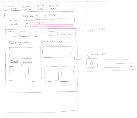

Some wireframes sketches.


Dashboard designs versino A


Dashboard version B
Validate
User Testing
We planed the user testing for myVicRoads account and ensured the prototypes including all aspects of services within the dashboard, such as short-term registration, demerit points, licence details, registration details, etc. The following findings only focusing on the dashboard feedback. (You can check demerit point feedback here.)
“It’s a little less busy compared to the original dashboard. It’s a bit more condensed.
I do like that it is coloured coded if it’s expired it’s red, amber for renewal”
“I think the prototype one is better. It’s much easier to look at and understand. There’s less scrolling you have to do. It captures immediately where the attention is, there’s a lot more understanding”
Overall
All 8 participants responded positively to the myVicRoads prototype dashboard, which is saying they preferred it over the current myVicRoads site as it offered a more succinct layout and better visibility of the key areas they felt were the most important within the account, such as licence and registration information.

Notification
The notification alert on the prototype dashboard was overlooked by 6/8 participants.

When asked to get a new licence if yours is stolen
Half of all participants were able to locate the information on their first attempt, using the external link ‘Lost or damaged licence’ within the contextual side menu on the dashboard or ‘My Licence’ page.
The remaining participants tried to locate the information via the ‘…’ ellipses CTA on the ‘My licences’ page.

Testing myVicRoads account separate from the existing website
When asked to navigate their way back to the prototype dashboard, participants struggled, attempting to log into the VicRoads site or using the back button on the external page. Most participants said they would prefer an integrated account experience that would allow them to access pages from VicRoads public-facing site within their account.
MVP - Quick Wins
The user feedback and prototype shaped our future vision of myVicRoasds account. However, we decided to improve the current dashboard content first. We started to define how we can improve the dashboard based on feedback. Some feedback for short-term registration and demerit points, also associated license replacement help us to improve information on license and registrations.
We rearranged the dashboard and instead of prioritising personal information first, we changed to registration and licenses. I redesigned licence details based on physical data card information. Also, we consolidated information of registration status and introduced the pay now button to indicate to users if their registrations are due.